Wednesday, March 11, 2015

Writing 3 (blog posts) for Critique 2

For this post, I need to update on how my last critique went. It was a good critique with good, useful insight from my peers and the instructor that was in my section, which was Josie, the art education instructor. While Josie and I are a little bit on opposite ends of the spectrum with how we do art, I'm very technical while she is very 'crafty,' we still discussed my pieces and were able to determine that for me to become good at illustrations, I need to create several pieces at a time so that I can learn from my practicing.

Wood Duck
art marker
6" x 6"

Male and Female Cardinals
art marker
6" x 6"
We both agreed that the Wood Duck piece was the stronger piece of the two and that the cardinals seemed a little bit hairy instead of feathery. My peers mentioned that they were glad to see me transitioning into color instead of solely working with black and white. I think that I'm glad about it too.

With Spring Break coming up, I hope to have time to create some more bird illustrations, and hone my skills a little bit more.

2. Mattie Parrigon is the next artist that I want to talk about. Mattie does such amazing work that just leaves my jaw on the floor every time that I see something new from her. Mattie's work is detailed and light, but evokes feeling that leaves the viewer wanting more.

Mattie's own project for this semester focuses on senior citizens and the stories that they have to tell. You can tell by the way that Mattie's face lights up when she is talking about her interview with these people, that this is what she loves.

While Mattie is still working her way through school towards a degree, she continues to create pieces that are just stunning. Check her out NOW!

Mattie's Blog!!!!!

Sunday, March 8, 2015

Editorial Illustration pieces and updates

In the Editorial Illustration class that I'm in, I originally thought that the class was going to be about working with political illustrations and cartoons. However, as the class has progressed, I've realized that it takes a lot more than just political illustrations.

Our first assignment was based on a basketball-sized object that we brought from home. Seeing as I don't really have a whole lot of large objects, I brought my stuffed gorilla. We had to create four different pencil drawings to represent a single word.


"Decay"
pencil
6" x 6"
 

"Isolation"
pencil
6" x 6"

"Rebirth"
pencil
6" x 6"

"Trustworthiness"
pencil
6" x 6"
As usual, it was noted during the critique of this class that I tend to use to much texture and tone in my pieces. The strongest piece was determined to be the "Decay" pieces, because it had a balance of tone and white.


The second assignment revolved around three different articles that were taken from the magazine 'The New Yorker.' After reading the articles, the assignment was to choose one article and illustrate it so the reader could understand what was going on. I chose to illustrate the origins of Wonder Woman. The idea for the comic came from suffragette days.


Original inked piece

Touched up piece of Wonder Woman


I made Wonder Woman the center of attention because that's what the focus of the story was. I used the lines of the poles of the suffragette signs pointing towards her so that it formed a "W" and emphasized her even more. I couldn't put Wonder Woman in her iconic costume, so I lengthened the skirt, but kept the stars. She is still wearing her 'bullet proof' bracelets and her crown on top of her hat.


My favorite part of this illustration was creating the feathers on the hats. That was the most freeing part and I was able to just have fun and not really worry.

During the critique of this piece, it was mentioned that the signs could have some scribbles on them. While words were forbidden, scribbles would give the effect that there were words on the sign. While my figure drawing has improved, the figure on the far right was not ideal and could have been rendered at a better quality.

It was also mentioned that the sign that Wonder Woman was holding should have been flat like the other signs instead of being 3-dimensional. It was confusing and should be the same as the others or make them all 3-dimensional.


The third assignment was an infographic on the topic of the students choice. I chose to cover the topic of recycling. We were limited to a color palette of 3-5 colors, not including black and white.


I really struggled with this infographic because it needed to be done on Photoshop and I had never worked in Photoshop. I spent a lot of time on this and ended up having 92 layers when I was finished.


During critique of this piece in class, it was noted that if the blue background had been a few shades darker, it would be less harsh on the eyes when reading.


It was also the opinion that I should have focused numbers of a specific recycling instead of the facts that I did focus on.

Vector Graphic Things

Currently, I am enrolled in Vector Graphics at PSU which is Adobe Illustrator. As I've never really worked with computers on this level before to create digital work, I've found it frustrating and interesting at the same time because one must make sure that paths are connected and must look at how they are in outline and 'regular' view. It has been interesting and yet challenging to work with the hot keys for each tool, but I've realized that by using the hot keys, it's a lot faster.

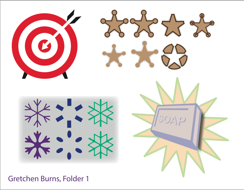
First Assignment in Vector Graphics

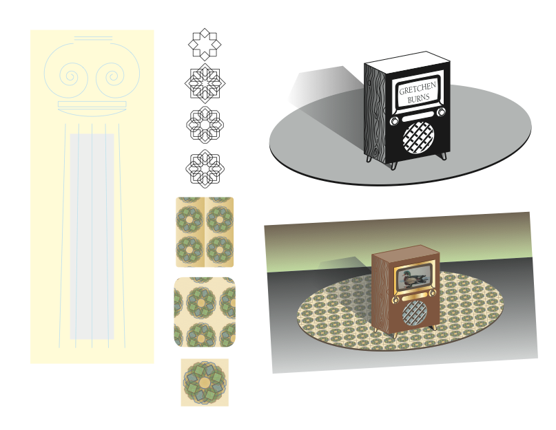
Second Assignment in Vector Graphics

I found the second assignment to be a lot more fun. It allowed me to be a little bit more creative, especially when creating the pattern. After I made the pattern into a 'carpet,' I realized that I would totally own that carpet, or would at least like to see it somewhere.

Life Drawing Sketchings

In Life Drawing, we've been slowly working our way through the body. For the first few weeks, we worked our way down the skeleton. I learned a lot about gridding out the body and proportions and whatnot.

The body and measurements

3-D views of skull

gridding out skull

Scapula and positioning

Spine, ribs and pelvis

pelvis and leg bones

Foot structure

Hand Bones and structure

Sketch showing under drawings of hand bones

showing how all the tools learned are
used to flesh out the figure